Hullo there everyone,
I have as some of you know this year had a certain birthday (ah, 21! you're so right! :D) and there were some extra special items received called PanPastels (PP).
Thought long and hard about investing in getting these but after conversing with B. or Brenda of Floral Fantasies, was convinced in the end of their merits. She does such lovely work with them and that is what sparked my interest (see here and here) and so did Eileen of Eileen's Crafty Zone - see here and here...

Now I am rather like B. in my use of PP, rather than how Eileen works with them. Eileen seems to go more often for the ultra bright use of them, and B. for scenes, backgrounds, etc. I like to apply them into everyday use.
I thought would cover few things here, as I could not find much info when researching, apart from help from Brenda.
Colour Choice:
Brenda said to go for your own choice, not sets and to buy a dark and light of tones. That is mostly what I did as well as some neutrals.
Brenda said to go for your own choice, not sets and to buy a dark and light of tones. That is mostly what I did as well as some neutrals.
In choosing colours just remember you can use other colouring mediums with them. I have used the S.U chalks and Do-craft sets; also I recently mixed dye inks and the PP in colouring.
My motto is "TRY and SEE if it works", as usually it seems too. They are very, very versatile. I was worried about not having enough colours BUT as they blend so well this hasn't ever been a problem.
I chose the any 5 pans for £20.00, from Oyster Crafts in UK. This Brenda said was the best deal she had found, and I agree. Post cost in UK is free, post cost to Australia was way over budget, so I had it sent to my UK family -> they posted it onto Oz (with my Greek slippers :D).
As it was going to be one off purchase for me, I chose the 20 pans, plus tray & "Sofft" tools.
Sponges: I like the flat shaped sponges best (using the flat of edge to spread colour), not so much the round flat set, but do use tool for fine areas.
Below have used the Sofft sponge and makeup sponge at front of desk, for comparison.

+(800x600).jpg)
Brenda said to get the Sofft sponges as they are much denser than regular makeup sponges. I agree but found it curious the makeup sponge (bottom purple line) was just as good as the Sofft sponge for them. I think it is easy in short uses; but long uses would become more difficult as looses shape easily.

Paper:
Used above smooth paper, with white embossed French Script background stamp, four colours (at right) to match the image. Actually find almost all paper types work well with PP, so down to personal choice.
Used above smooth paper, with white embossed French Script background stamp, four colours (at right) to match the image. Actually find almost all paper types work well with PP, so down to personal choice.

This is linen cardstock with Stampscapes scene ~ stamped first, then coloured with PP.
Laying down colour:
Colouring is important, working in same way as with brayer is helpful. I use, if doing large area like in the embossed French script background, a light shade as base coat over whole area, then it is much easier to blend with other colours to achieve desired shade.
Darker colours are sometimes rubbed off on scrap paper before adding to mix. You can rub them out but better if dont have to do it,
Darker colours are sometimes rubbed off on scrap paper before adding to mix. You can rub them out but better if dont have to do it,
My father is an artist (see his work here and here), and he often starts canvases with an application of white oil paint (titanium white) on the whole of the canvas before building up his scenes.
Stamp before or afterwards?
+(800x647).jpg) |
| Colour Spellbinder shape with PP, then stamped below, with black Archival ink |

I could not find any clear help on this question, so have tried both ways, and think mostly afterwards is best.
When
I brayer usually stamp after brayering unless it has masking but with
pastels found if you stamped image then coloured you loose some definition. Now some
night like the softer look but not sure I do. +(800x638).jpg) |
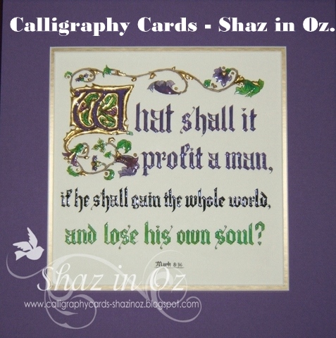
| card 1 - with flower stamp from Scripture by Design, card sent to a Missionary friend in P.N.G, a good Bible verse for us all. "He shall give His angels charge over thee to keep thee in all thy ways.". |
The cards above and below is inked after colouring with pastels. The small sample linen Stampscapes scene card is inked before, so I will let you choose.
 |
| card 2 - published before so not entering it in challenges |
To seal pastels, or not to seal?
Usually I do prefer to set the pastels only because I like the look better - just spray several light sprays of hairspray (which Eileen suggests and uses).
I also use Diamond Glimmer Mist for the light frosted look which I love.
However I think Brenda says she does not.
See this post here for details on how this card on left was made with smooth paper, PP and Penny Black image.
{Edit: Hero Arts Delicate Leaf Cluster stamp}
{Edit: Hero Arts Delicate Leaf Cluster stamp}
Well, everyone I do hope this answers your queries on this matter - if any have more queries please ask, as tried to cover the queries which I had.
I will return comment, as much as able again - thanks for your patience :D you are really appreciated!
Thanks so very much for popping over for a peek and chat ~ and may God bless your day wherever you maybe!
Shaz in Oz.x
PS I would like to enter the Flower card in following challenges:
- Words Art Wednesday - Anything goes card 1
- Stampin Sensations May Challenge - Embossing - dry or wet - enter card 1
- Anything goes challenge blog - Shaped but not square - enter card 1
- Without Words challenge - Flower for May - card 1
scrappystickyinkymess (http://scrappystickyinkymess.wordpress.com/)
I have to admit to a real fondness for plastic wrap as a crafting tool. Have you tried this? Scrunch p a bit, and tamp it onto a Versamark pad, then onto the cardstock. Before it dries totally but after it's not too "wet", dust on the Pan Pastels. Looks really pretty!
EDIT 2: found two great posts - this isone on B.'s Blog - it answers a lot of queries:
http://stamping-fantasies.blogspot.com.au/2012/11/pan-pastels-questions-answered.html
and one on Franka's Blog - shows using different toned inks over the PP - with great effect:
http://seasideart-fb.blogspot.com.au/2013/05/panpastel-giftcards.html

+(600x800).jpg)
12 comments:
Hi Shaz
That's really interesting about the PPs. I've been tossing up for ages trying to decide if I actually need them :)
Hm, maybe I do :)
RosA
Wow Shaz, very thoroughly covered - thank you so much! Now I need to start saving :)
Hugs, Di xx
Hi SHaz,
I can see the Pans are really working their magic with you, or perhaps that's the other way round. Anyhow, some lovely soft and delicate looks.
Have to admit I've never tried using Gliimer Mist with PP's, something for another day. However, I do love giving a sprat over my Dylusions, one it helps bleed the colour and two give that nice shimmer.
Not that I am trying to lead you astray here you realise, I heeded your warning the other day when I used my Dylusions.
B x
Really glad to see someone else proclaiming the benefits of using Pan Pastels.They're great aren't they!
Now for a closer look at your post.
Judy #25
Your art is just wonderful and SO inspiring. I'm so glad that you got your stamps and goodies from Scripture by Design and happy that you like them. This turned out just beautifully using them. Thanks again for sharing with us, and I hope you're having a GREAT week. We love seeing your art shared in our challenges.
Blessings to you,
Karen
Word Art Wednesday
Shaz you have done an amazing job and I like the sounds of any 5 for that prize. I have three at the moment and want to get more. Thanks for joining us at Stamping Sensations.
Pinky
Sharon, THANK YOUfor the very informative post on the PP's. I was encouraged to see I had ordered my colors rightly (copic learning...family colors in light, medium, dark). I got my PP from Dick Blick, ordered enough to get free shipping. I had seen a video done by Jill Foster, so it sent me to the website. I will check out the links you provided here (and thanks for that as well). Your samples are lovely. I especially liked the S/B cutout, and I preferred the darker one as well. More contrast. (I'm challenged with contrast, so trying to work on it!) I have the leaf stamp you used, so I MUST try this. Thanks for taking time to write all this post, as it really was so instructive to a newbie with PP's! I'll have to get caught up enough to try this, and post - either a big mistake first effort, or hopefully, something I will be pleased to have done! I'll link to this post, if I may, when I finally get something created!!! Hugs
Wow! These are just so beautiful! Love them! Bravo!
Your work with those pastels is stunning, beautiful cards. Thanks for joining us at Without Words. Joey xx
Your flower card is so pretty! Great tutorial and tips, very interesting, thank you for sharing:)! Thanks for joining us again at Without Words and good luck! Hugs Delphine xx
What a wonderful creation. Love the pastels in your cards. Thanks for blessing us with your artwork this week at Word Art Wednesday. God bless, always!
JO ANN
http://jatterburycreations.blogspot.com
Thanks for sharing all these tips, it's very much appreciated. The image you used on your last card, the blue one, is from Hero Arts, not from Penny Black, isn't it? The card is beautiful, though!
Post a Comment